GABÉ
Client: GABÉ
Keywords: Brand Identity, Packaging
Keywords: Brand Identity, Packaging
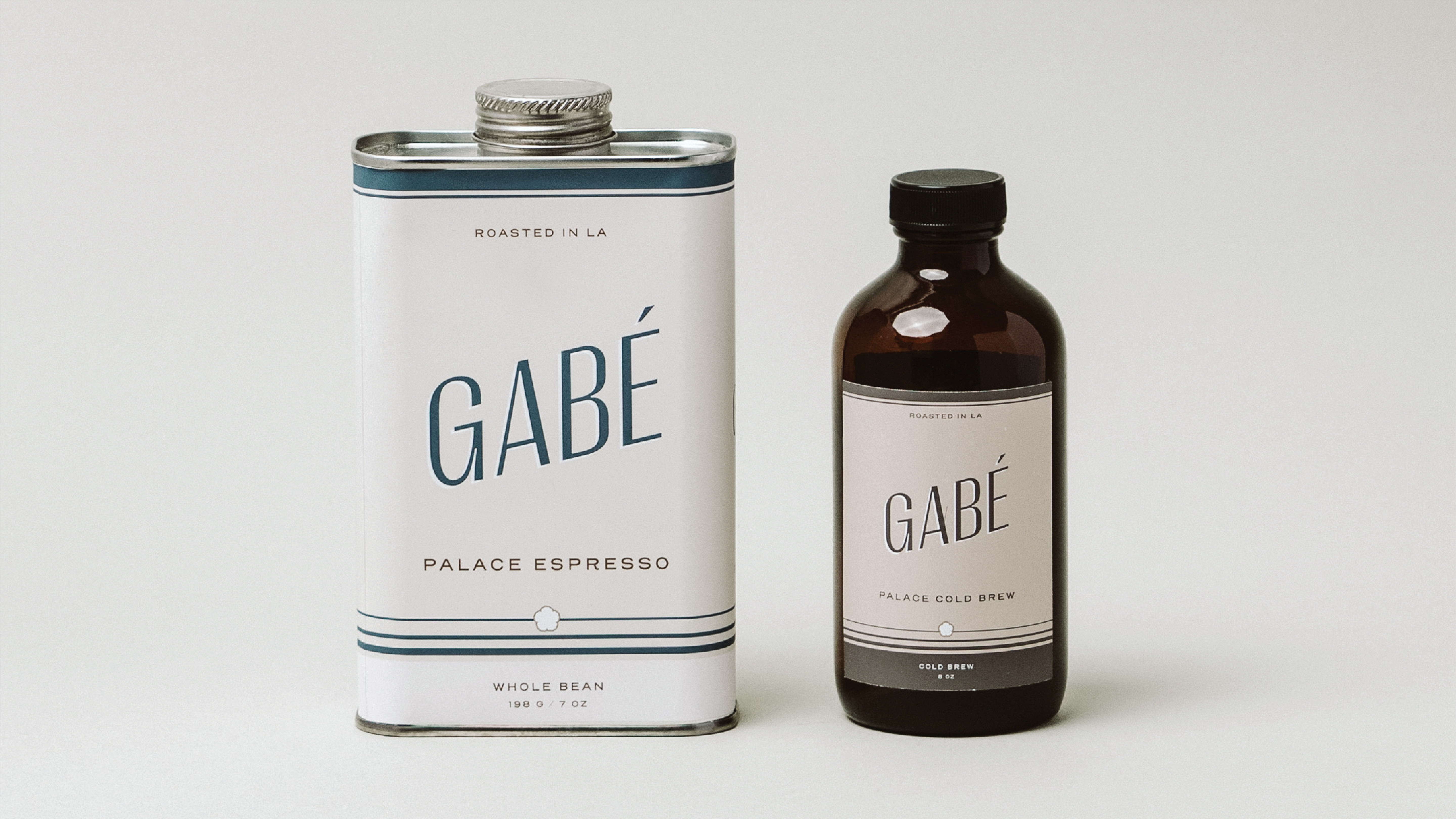
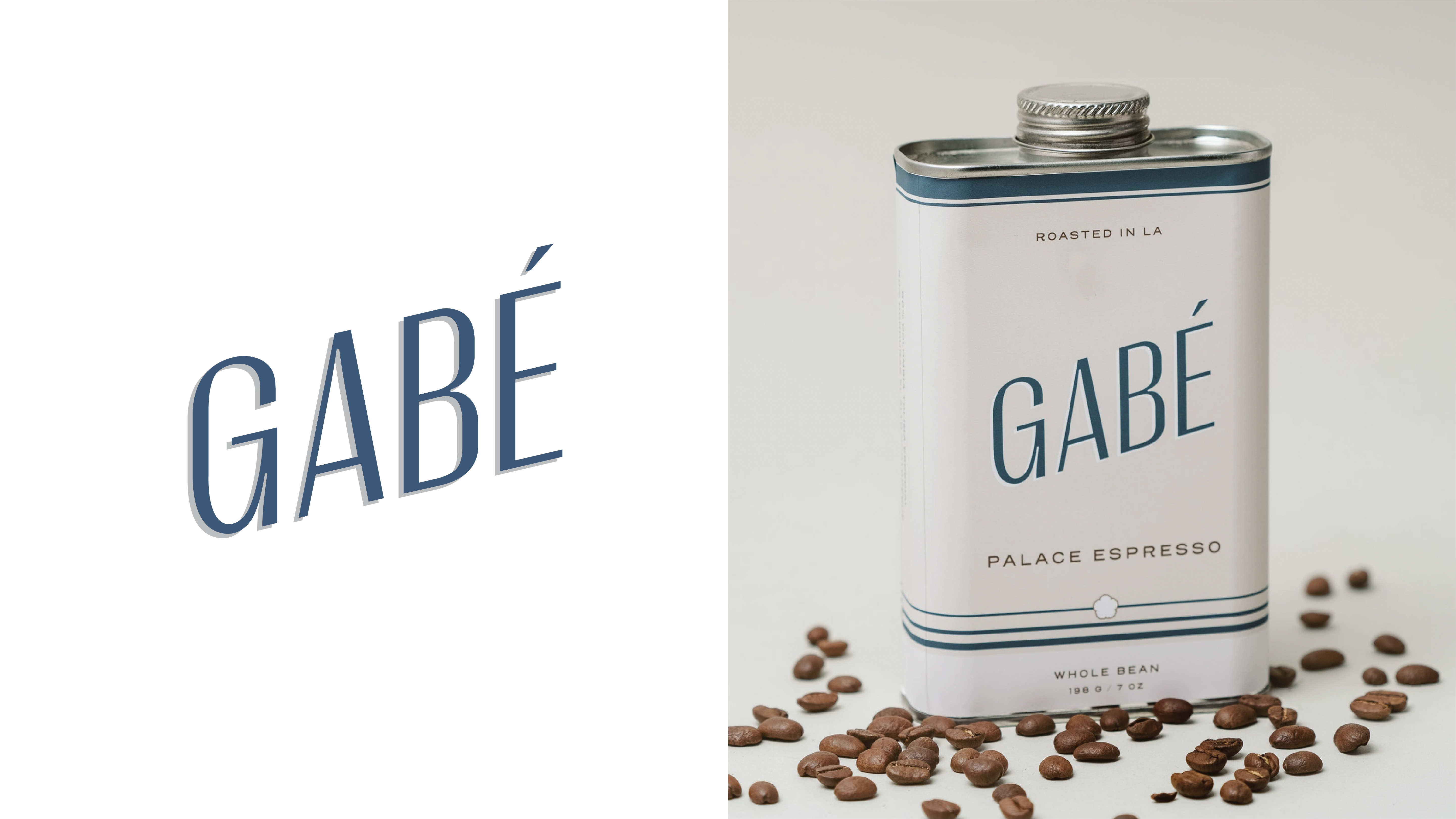
The namesake, GABÉ, comes from the term for coffee during the Joseon Dynasty (1392-1897) in Korea. GABÉ is a return to Korea’s roots and a homage to those that came before. The brand partners with Korean roasters that place an emphasis of excellence, sourcing transparency, and taste.
The brand identity is inspired by Korean packaging design from the 1980s—such as offset printing on food labels, use of various strokes and borders, to illustration styles from Korean advertisements and comic books.
The brand identity is inspired by Korean packaging design from the 1980s—such as offset printing on food labels, use of various strokes and borders, to illustration styles from Korean advertisements and comic books.


Emperor Gojong
The former king of Joseon was said to be an early admirer and champion of coffee. Coffee became a daily routine for Gojong and continues to be an important part of Korea’s lifestyle. GABÉ toasts their lineage to the emperor and history of Korea. The illustration style was inspired by the offset lithographic printing and Korean comics from the 1980s.
Illustration by Seohui Chi.